The Hidden Meaning Behind the Panera Logo
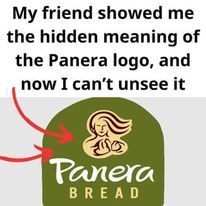
Panera’s logo has seen quite an evolution since its beginnings as The St. Louis Bread Company in 1987. Despite rebranding to Panera in 1997, one element has consistently remained—a woman holding a loaf of bread. This symbol is central to the brand’s identity, capturing the warmth and care associated with their freshly baked products.
The latest logo adds a fresh twist while maintaining this iconic image. The woman now faces the camera, providing “a personal and inviting touch,” as if you’re about to share a meal with a friend. This subtle change enhances the logo’s sense of warmth and connection.
But there’s more than just a friendly face. The green arch forming a semi-circle in the background is more than a decorative element. It’s designed to “resemble the mouth of an oven,” symbolizing the core of Panera’s bread-making process. This green arch isn’t just about the oven—it also represents Panera’s dedication to “using natural products” in their recipes, with the color evoking the freshness of nature’s bounty
So, next time you enjoy a Panera meal, take a moment to appreciate not only the flavors but also the thoughtfulness behind the logo. It’s more than just branding; it’s “a story of warmth, evolution, and a commitment to quality.”